Insight
Seeing Double with Bubbles
A bubble graph for exploring a collection of datasets, and a discussion on visual redundancy for multifunctional visualization.

Figure 1. Screenshot of the interactive visualization for exploring a collection of datasets. Each circle (bubble) represents a dataset. The dataset features (e.g., area, age group, level, type…) are those used by our partner GGD, the public health services of The Netherlands. The datasets shown in this example are fictitious and were randomly generated, for confidentiality.
What we did…
We designed as interactive visualization (Figure 1) with a bunch of colourful circles (online demo: https://ggd.dss.cloud/). Our partner GGD, the public health services of The Netherlands, has collected and curated a large collection of 100+ datasets [1]. This national organisation operates at a municipal level, and has many departments, offices, and projects …and thus many datasets. It was not always easy for GGD employees to find out what datasets already exist and could be useful for a new project or situation. This is why we did this interactive visualization, with a bunch of funny bubbles that represent the datasets in GGD collection.
The screenshot above (Figure 1) shows 100 datasets, each represented by a bubble. If we were looking at a hundred lines in a data table, it may not be very pleasant… Well maybe it is nicer to look at those bubbles, but could we have done a better visualization? Should we change this or that? Maybe you’d like it differently. We all have opinions, and design is always arguable. So this blog post presents some design choices we made, and the reasons behind them.
How it works…
The group of coloured bubbles shows the collection of datasets of our partner (in this example we use dummy datasets for confidentiality). Each bubble represents a dataset and its characteristics. The top left panel shows the detailed features of a dataset (in Figure 1, the selected dataset is titled Simulated Data). The dataset features can be edited, or searched with free text, using the upmost left bar.
The datasets have many features, which are shown in the bubbles using different visual elements: color, size, contour, and inner icons. The bottom panels show their legend. The bottom right panel shows the legend for the bubbles’ size (number of data points), color (the department owning the datasets), and contour (the years for which data points were collected, represented as black sections of the contour).
The bottom left panel shows the legend of the icons that are displayed inside the bubbles. In Figure 1, the icons show the type of dataset (these are labels that GGD, our partner, uses to classify the data collection process and purpose). Multiple types can be assigned to each dataset, and they are represented as black branches of the icon.
Several dataset features can be visualized in each bubble, but not all at the same time. The inner bubble glyphs can display 4 possible features, shown in the bottom left panel, but only one at a time. In Figure 2, instead of showing the type of datasets, the bubbles show the age groups as a set of 4 icons (as a dataset can have multiple age groups).
Users can select which features to display using the headers of the bottom panels. The clickable eye icons control which dimensions are visualized, or not.
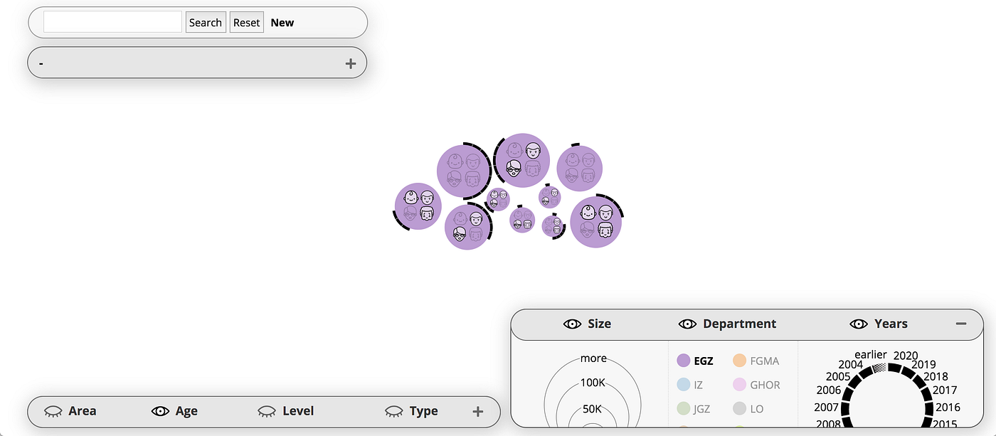
Figure 2. The bottom right panel is used to filter datasets from a single department (EGZ is selected in the bottom right panel). The panels can be collapsed, and the bubbles’ position dynamically adapts to the space left between the panels, and to the window size (a small window in this example). The inner content of the panels scales dynamically too, but is kept at a minimum size for readability (users need to scroll to see all the content — which may not be an optimal design).
The bottom panels can also be used to filter the bubbles, e.g., to select datasets from a single department or age group. Each label in the bottom panels can be selected as filter. For example, in Figure 2, the department EGZ was selected as a filter in the bottom right panel. All the bubbles that are not from this department (i.e., that are not purple) are filtered out.
What is arguable…
You may notice a visual redundancy between the top left panel and the bottom panels. The main dataset features are represented twice in different panels, in a visually similar manner. For instance, the icons representing age groups are displayed both in the top left and bottom left panels. This redundancy may clutter the visualization, and could confuse users. What was the tradeoff for this design, and was it the best choice?
This is the topic of this blog post. Many other design choices we made are certainly arguable, but for now we’ll talk only about the visual redundancy issue 🙂
Multi-dimension & multi-function…
It seems quite a bad idea to duplicate the labels of the data features in the interface. For instance, there are 4 labels and icons for the age groups, 5 for the levels, and they are represented twice (top left and bottom panels). So just for these two features, age and level, our design tries to fit in 18 small icons!
The datasets have five other features (also called dimensions). The more the dimensions, the more space is needed to fit their labels twice in the panels. Actually, we could not fit all the icons in the top left panel… We used icons only for age and level. Other dimensions were stripped of their visual elements and shown as plain text (area, type, size, time).
The bright side of using fewer visual elements in the left panel is that it looks different from the bottom panels. This may help users to understand that the panels have different functionalities. Actually, the multiple functionalities is also what makes the visual design challenging. It’s not only the multiple dimensions of the data!

Figure 3. The datasets are filtered to find recent datasets (year 2020, right panel) of large size (50K or more, right panel) with unknown age group (left panel). The icons inside the bubbles show the Level of the dataset (a label used by our partner). A dataset is selected and is ready to be edited.
All-in-one …?
The interactive visualization has multiple functions:
- Overview the collection of datasets (bubbles)
- Caption the graph with legends (bottom panels)
- Filter the datasets with specific features (bottom panels)
- Show/hide visual dimensions (bottom panels headers)
- Detail a dataset’s features (top left panel)
- Search with text in all datasets features (upmost left bar)
- Edit or create a dataset (top left panel, Figure 3)
That’s quite a lot of functionalities in a single page interface… There’s always the option to use two different pages for editing and overviewing the datasets. Or maybe more than two pages. But let’s try to design a single page interface, as best as possible.
The panels combine several functionalities, three for the bottom panels (filters, legend, and showing/hiding the visuals) and two for the top left panel (detail datasets, edit/create). Having multifunctional panels limits the visual space needed to fit the functionalities. We just need two types of panels (bottom and left panels).
But the content of these panels is redundant: all the labels of the multiple dimensions must be displayed twice. We could attempt to fit everything all together in one place, instead of having to display these labels several times. Let’s see how that could work…
Let’s try…
The difficulty with having an all-in-one display, is that each label needs to be selectable for different functionalities: for filtering (as in the bottom panels), or for detailing and editing a dataset’s features (as in the top left panel).
For instance, in Figure 3 the year 2020 is selected in the bottom right panel. It is also part of the labels in the top left panel (editable as text fields). Now let’s assume that we get rid of the top left panel. Now the bottom right panel has all the functionalities. So the panel needs to show the years used for filtering and the years that apply to a specific dataset.
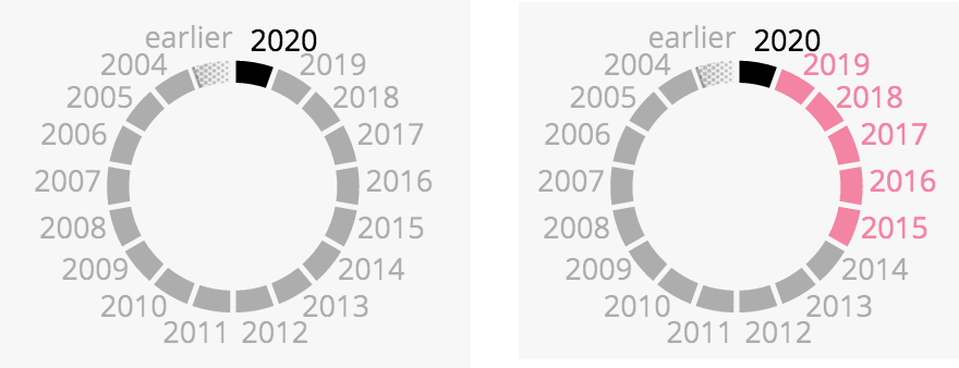
Figure 4. Adaptation of the widget used to show the years (bottom right panel). The left widget shows only the years selected as filter. The right widget also shows the years that apply to a specific dataset (e.g., the one selected in Figure 3).
Let’s take the wheel showing the years (Figure 4), and let’s try to show that year 2020 is selected (as a filter) and that years 2015–2020 are also selected (as the features of a specific dataset). This is not easy, but one option is to do as in Figure 4.
Basically we can use a bubble’s color to show the years that apply only to this bubble (pink in this case, as the bubble selected in Figure 3). This way we can use different visual elements to show what is selected for what. Black is for what is selected as filters, and color is for what applies to a specific dataset.
Well that’s not very good… The consistency is broken between the time widget and the bubbles. The bubble contour can only be black — or transparent. If the time widget also serves as legend, then the pink color is quite confusing. Actually, it’s also hard to explain in this blog post. Maybe I lost you readers 🙂

Figure 5. Adaption of the time widget, as in Figure 4, but year 2010 is also selected.
Another issue occurs when several years are selected as filters. For instance, if years 2020 and 2010 are selected as filters, both years are shown in black (Figure 5). The selected dataset does not have year 2010, but won’t be filtered out because we keep bubbles that have year 2010 or 2020 (not 2010 and 2020, as we’d have lots of empty results). Looking at Figure 5 (right), it is impossible to know if the selected dataset has the year 2010 or 2020. It must have at least one of these, but which one?!
Let’s try again…
Another option is to show the dataset’s years 2015–2020 in black, and use another color for the years selected as filters. But which color?! The bubbles are already using (too) many colours. Actually, we tried to differentiate color tones that were too similar by using more flashy or more pastel versions (flashy orange and pastel pink, flashy light green and pastel dark green).
Perhaps it would be better to display either the filters or the dataset features, but not at the same time. If a dataset is selected, the bottom panels show its features. If no dataset is selected, the bottom panels show the filters. We would still need a visual element that indicates what the panels are showing (filters or dataset features). For instance, when showing a dataset features, the color of the panel headers can be changed to the color the dataset’s bubble.
In any case, we would need to add another panel to show the dataset features that are not in the bottom panels (description, keywords, indicators, contact, publication). The features of a dataset will be split into several panels, and users will spend extra effort to locate information, remember where to find it, and perceive lots of content changes in the panels as they explore the bubbles.
Both eyes at a time…
With an all-in-one design, it is difficult to show the features of a specific bubble and the features used as filters, both at the same time. It is difficult to maintain the visual consistency of the legends, and to show filters and dataset features that do not match perfectly. Our eyes would have to interpret different things with the same visual elements, which can lead to confusion and fatigue.
On the other hand, if we keep the top left panel, we may duplicate the feature labels, but at least the function of the labels is clear. The bottom labels are for filters — and for legends too, to be opportunistic. But it’s all about controlling the group of bubbles in the visualization. The top left labels are only about controlling one specific bubble, for detailing its characteristics or for editing them. It remains simpler visually and cognitively: bottom is for the group of bubbles, top left is for a specific bubble.
When the user looks at the top left panels, there is no need to know what the bottom panels show. And vice versa. Users can keep both eyes at the same location: bottom or top left. So well … is there really a redundancy issue when you don’t keep both panels in sight (or in mind) at the same time?
We better do user studies to find out, instead of speculating like that… but we first need to invent designs, and speculate about them, before testing them 🙂
That’s all folks…
Maybe you have other ideas about all this, we’d love to hear about them!
This work was possible thanks to awesome people at the Digital Society School of Amsterdam University of Applied Science [2]. A special thanks to Jake Henderson, Abdo Hassan, Nicoleta Pana, and Wouter Meys for contributing to this interface with their brains and sweat 🙂
[1] Our partner: https://ggdghor.nl/
[2] Us: https://digitalsocietyschool.org/
[3] The visualization: https://ggd.dss.cloud/