Project
ONLINE STUDY SPACE 2
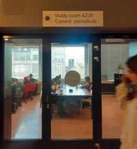
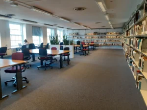
With Digital Society School we conducted research among students in UvA Library to discover their needs and pains towards co-study. The research took place during exam week. Students were busy, we couldn’t interfere with someone studying, and we approached them during breaks or lunch.
We had 3 touchpoints. The interview and the survey aimed to probe core assumptions. ”Feeling Board” served two purposes. Firstly, when most people describe a space or situation, they do so in terms of how it “feels.” Feelings affect how people experience space and influence their perception of that space. Secondly, while dealing with a broad group of people, it’s a challenge to attract attention, and hunt respondents in the field. ”Feeling Board” played the role of an ice-breaker or an open invitation.
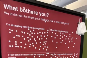
Here are the main research process takeaways
- Context matters. We put one ”Feeling Board” — into the collaboration room where students study, and another into the cafeteria. Board in the collaboration room was full of responses much earlier. Statements about feelings and studying turned out to be more relevant for students in the context of actual studying. While in the cafeteria students are more relaxed, chatting with peers away from studying context.
- Look for respondents in their ”natural habitat”. To invite students to fill out the survey, we advertised signs with QR codes nearby the coffee machine, so students could participate in the research while waiting in line. Place nearby coffee point worked out way better than the same signs nearby elevators when people just passed by minding their own business.
- People tend to join groups. When students saw a group of people having a chat (interview) or interacting with the ”Feeling Board” they naturally wanted to find out what was going on and join in. The people participating in a physical experience influence perception of the experience. Seeing other active participants communicate that you also can interact and it is socially acceptable to do so.
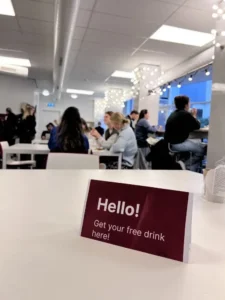
4. Engagement hooks. Being already engaged in one activity made students open to participating in another as well. Interact with the board? Ok, why not fill in the survey? Let’s do it! And vice-versa. Also, it helped us to invite some of them in for the interview, more than hunt for respondents somewhere in the library halls.
5. Incentives are king! Even small things like a free coffee from the coffee machine in the cafeteria help to warm people up and start one of the most powerful advertising in the world — word of mouth. For the interview we offered a 5-euro grocery card.
Last but not least take away — analyze the research process every moment, to be ready to adjust it accordingly to the situation and target group response.
Weeks of UX tests with students — what went right and what went wrong
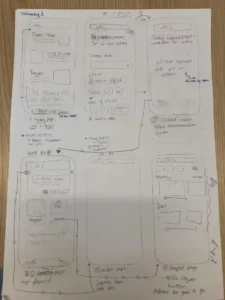
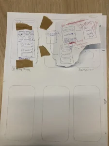
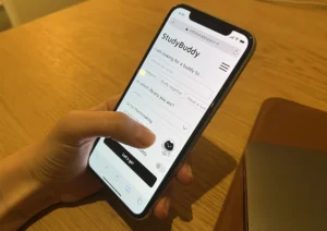
In the last 20 weeks at Digital Society School Amsterdam we researched, experimented, and prototyped a new version of a web extension for the UvA Library. To make sure that all hypotheses are valid and see what works and what doesn’t we had 3 prototype test sessions: a hallway test with 3 participants, and 2 wireframe test sessions with 13 and 6 respondents respectively.
Respondents
I am happy that this project provided us with limitless access to users and respondents. I wrote more about it here. When we needed new respondents we went hunting in the cafeteria when students are away from their commitments, relaxed and chatty. In our experience, when approaching a group of people it’s likely that all of them would like to participate. So don’t be shy about approaching groups rather than individuals if you need to hire more people for a shorter time. Also, it seemed that individuals are more reluctant to do any interviews or testing sessions vs people in groups.
Test sessions
Hallway test was the first glimpse of our ideas in the eyes of students. We showed a couple of really lo-fi wireframes to students, explained the purpose, and asked for their opinion. This quick interaction helped us to identify what features need to be developed, and gain insights into students’ behavior and the way they approach different situations.
If you are not testing products designed for noisy areas, test sessions should be conducted in a relevantly quiet place, and in silos — so people’s opinions won’t affect each other. Once, we scheduled with a mistake and conducted 2 sessions simultaneously in the same room. It was distracting for us and was obvious how people repeated the same thoughts after each other.
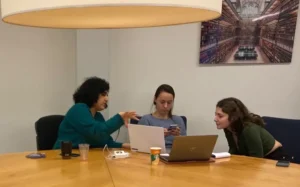
All things that unclear to the user is a research data for a design team. Something to work on further.
- Don’t ask probing questions when the user tests prototypes. I know how tempting it is to highlight some features or buttons to the user: ”Hey, look if you press here you can find more filters!”. If the user missed it — simply means that something about this button should be reconsidered. Ans all questions can be asked after.
- Don’t make any changes to the prototype before all participants run through it. Even if all participants miss the same button (they keep missing that filters option) — do not add it in the middle of the test. Otherwise, the research data won’t be consistent.
Document the data
Think about how document and present the research data when starting to design the test session. What do I want to know? Why do I ask these questions? Why get answers on this is important? What does this knowledge give to a product? Method of 5 why can be applied here to come up with more questions.
With users permission sessions can be recorded, and on one hand, by recording you don’t have to take notes, you can document everything later from the recordings. But personally for me, it’s important to write down all ideas and insights that struck me during a testing session, while it’s still fresh. It’s a good idea to schedule the tests with a break between them to collect findings and make notes. Write all of them down and briefly discuss with the team.
Conclusion
Testing wireframes helps to get rid of biases. If it doesn’t personal biases from the design team can mislead the process. Like everything in life, practice makes perfect. It’s better to make mistakes on a prototype than on the finished product
It’s wrong to think that professionals don’t make mistakes. They do, but they learn from them fast.
Thank you!
